Getting your users over the “suck threshold” sooner
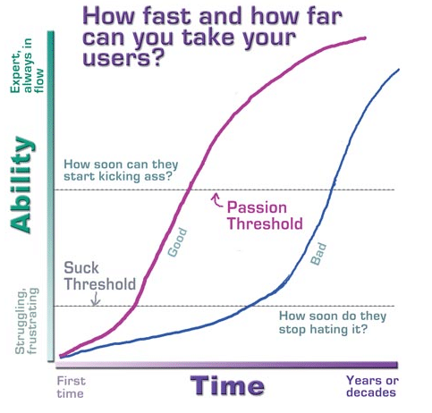
You’ve worked hard to build a great app and have done a bunch of work to promote it. You’re getting signups but too many of your new users are fizzling out and leaving before they get their first win in your application. Kathy Sierra calls this getting over the suck threshold:

Image credit Kathy Sierra
You need to improve your first-time user experience but how do you do that? How do you help your users get over the suck threshold faster?
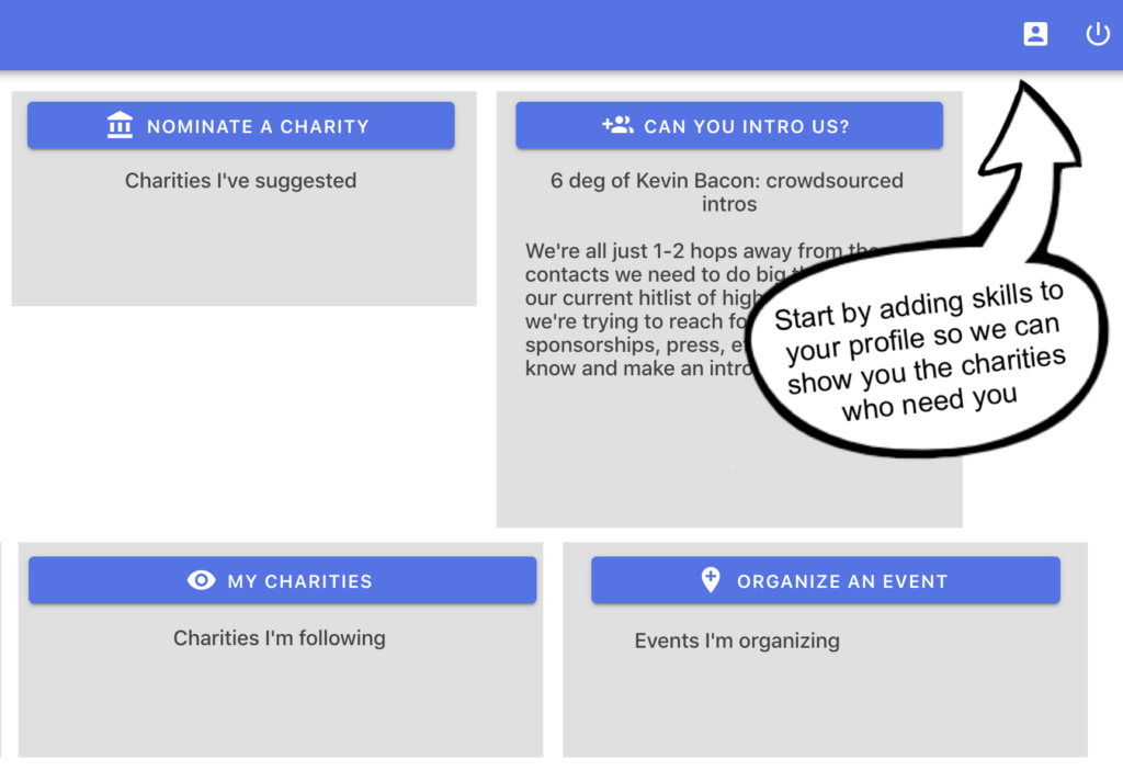
If your app is built in Adalo you can easily create a custom walkthrough overlay that hand-holds your new users through the steps necessary to get them their first win. This overlay will conditionally display custom visual cues to your users in sequence until they take the necessary actions that get them to the point where they’ve accomplished something that makes them want to come back.
What’s different about this approach
You’ve undoubtedly experienced one of those visual walkthroughs when first logging into a new software application.

It likely took the form of a tour that explained the gist of how to get started and maybe it was even interactive, but chances are it was a canned, one-time, linear sequence – essentially a slide show. The technique I’m about to teach you is better because instead of being a one-time canned tour, it’s a smart, persistent set of visual cues that handhold the users through a series of steps until they achieve their first win.
Why this matters
What is the impact of getting more of your users past the suck threshold early on? Well for starters:
- More engagement means less churn/attrition and a wider funnel.
- Every dollar you spend on advertising or hour you spend on organic traffic promotion yields more return.
- New user satisfaction improves and consequently…
- Referral rates on your application go up because your users are delighted with the experience.
Boom! For a few minutes of work this technique pays dividends indefinitely unkinking the hose with your new signups. So let’s dig into the nitty gritty of how it works.
How it works
The video below shows you first the front-end experience as a new user so you can see how it works:
And this video shows you the back-end of how to create this experience in Adalo using layers of elements with nested visibility rules:
Pretty cool, right? Try it out with your own app and see what it does to your new user engagement. Post any questions on this technique in a comment below.
This is my first post. I’m trying an experiment for the next month documenting a bunch of useful insights I’ve gleaned from having worked with various nocode tools and platforms for the past few years. If you want to get juicy tips like this one join my list below. And if you found value in this the greatest compliment you can pay is that of a referral or a social share. cheers
